...
On New Customer Attribute page
| Status | ||||||
|---|---|---|---|---|---|---|
|
Properties
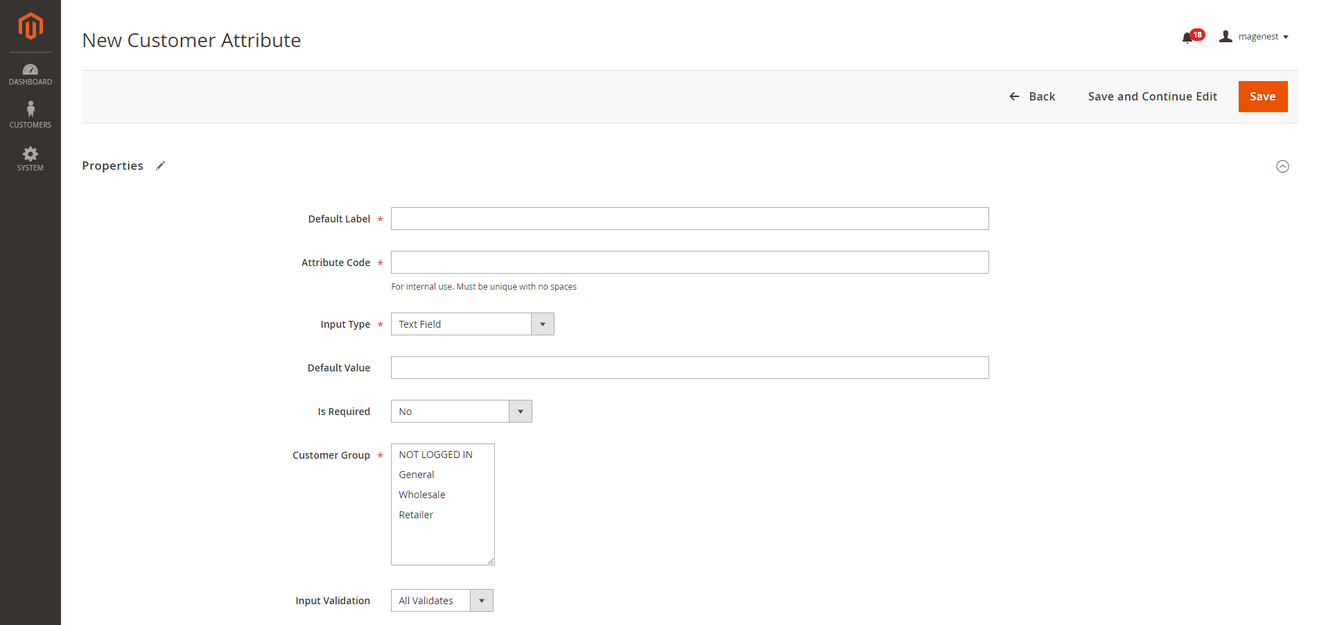
 Default Label: enter the name of the attribute which will display as the attribute title on the frontend.
...
Input Type: there are 9 options for the input type of customer attribute.
...
| Status | ||||||
|---|---|---|---|---|---|---|
|
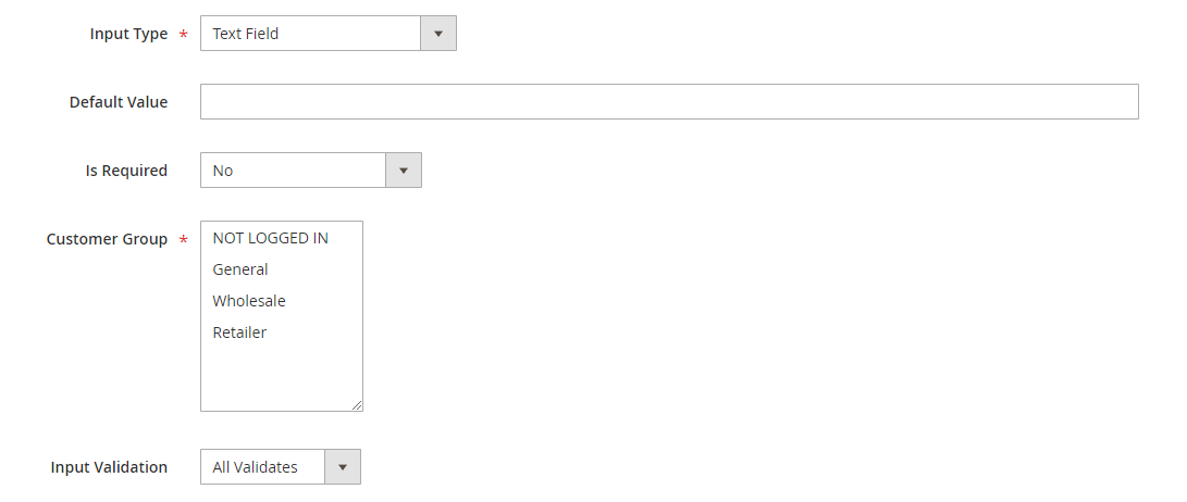
- Default Value: enter the default text which appears in the field as a suggestion. Customer can edit the text.
- Input Validation: select among 6 options: Alphanumeric, Numeric Only, Alpha Only, URL, Email, Date and All Validates.
...
| Status | ||||||||
|---|---|---|---|---|---|---|---|---|
|
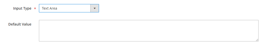
- Default Value: enter the default text which appears in the field as a suggestion. Customer can edit the text.
...
| Status | ||||||
|---|---|---|---|---|---|---|
|
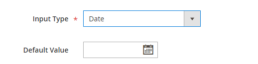
- Default Value: choose the default value which appears in the field as a suggestion. Customer can choose another date.
...
| Status | ||||||||
|---|---|---|---|---|---|---|---|---|
|
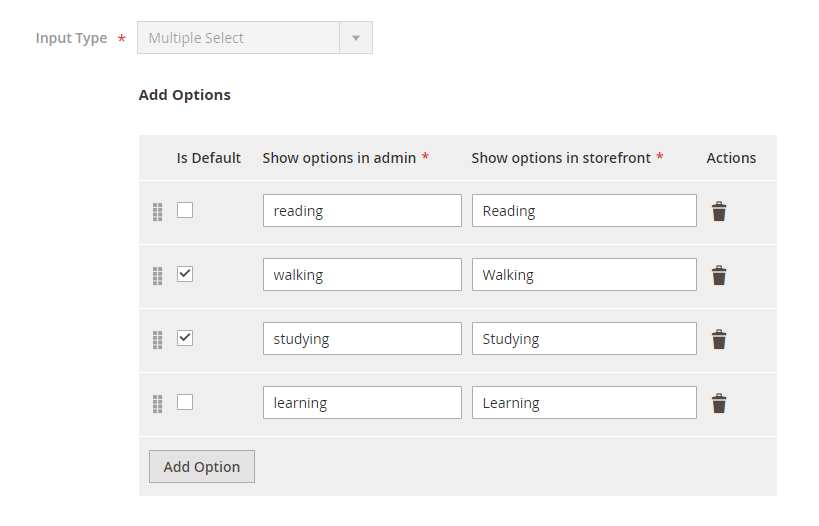
- Click on Add Option button to add more option to the drop-down list for the attribute.
- Tick on the tickbox under Is Default column to set the option as default.
- Show option in admin: enter the title of the option which displays on the backend.
- Show option in storefront: enter the title of the option which displays on the customer side.
Multiple Select With Images
| Status | ||||||
|---|---|---|---|---|---|---|
|

- Click on Add Option button to add more option.
- Choose the image and fill the title for each option.
| Status | ||||||||
|---|---|---|---|---|---|---|---|---|
|
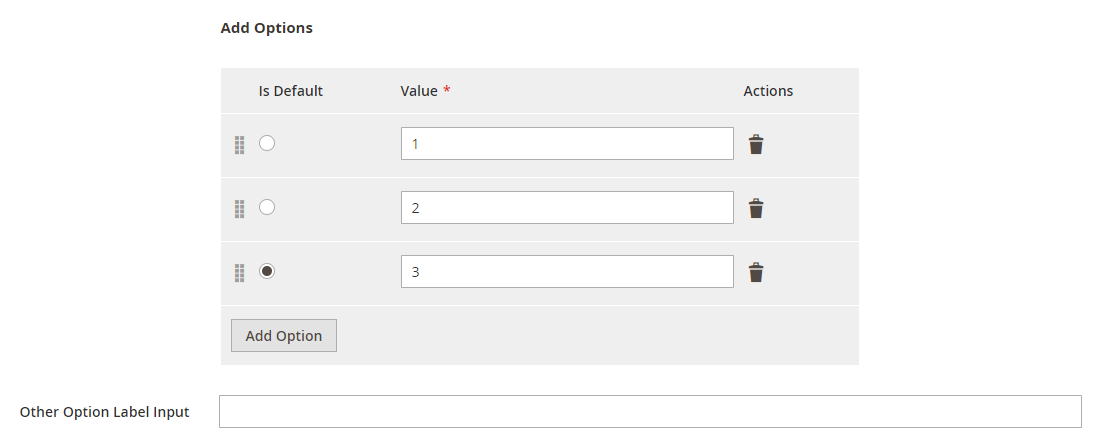
- Click on Add Option button to add more option.
- Value: Enter the title for each option in the dropdown list.
- Other Option Label Input: enter the text for the last option in the drop-down list, which is the option for the customer who has the question beyond the listed answers in the default list.
| Status | ||||||||
|---|---|---|---|---|---|---|---|---|
|
- Default Value: choose the value that will be marked by default. Customer can choose another option.
| Status | ||||||||
|---|---|---|---|---|---|---|---|---|
|
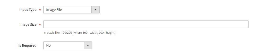
- Image Size: set the layout size for the uploaded image. The size unit in this field is "pixels". Follow the note under this field to set the proper size.
| Status | ||||||||
|---|---|---|---|---|---|---|---|---|
|
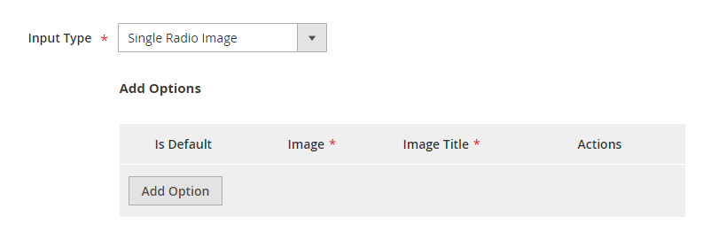
- Click on Add Option button to add more option.
- Choose the image and fill the title for each option, which will display with the image.
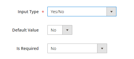
Is Required: decide whether the attribute is required to be filled by the customer or not by choosing Yes/No.
Customer Group: select the customer group to display the attribute.
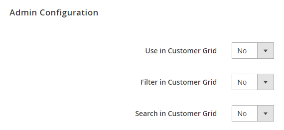
Admin Configuration
This section allows setting the display position for the attribute in backend by choosing Yes or No in each field: Use in Customer Grid, Filter in Customer Grid and Search in Customer Grid.
Store Configuration
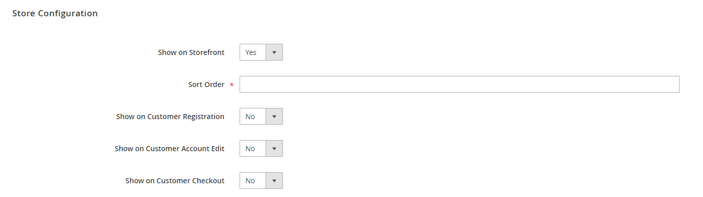
This section allows setting the attribute display in the storefront: on Customer Registration page, Customer Account Edit page or Customer Checkout page.
After finishing the setup, click Save to save the attribute and view on the frontend.