Thank you for purchasing our extension. If you have any questions that are beyond the scope of this document, please feel free to contact us, we will be happy to assist.
Updated: 1329/04/2020 2021 | By: Magenest | Email: [email protected] | Support portal: http://servicedesk.izysync.com/servicedesk/customer/portal/151
...
Configuration
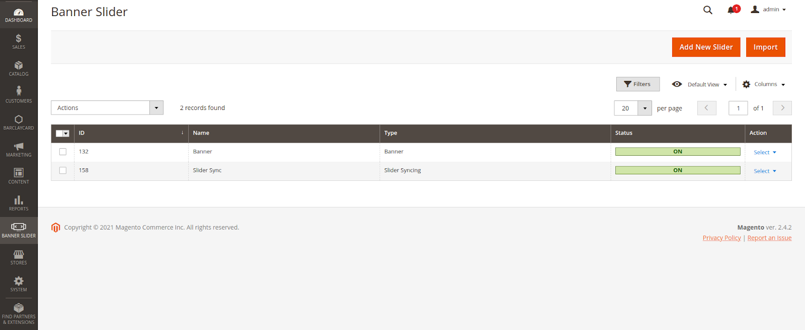
 On the Admin sidebar, click on Slider, then choose Manage Slider. choose Banner Slider > Manage Banner Slider
On the Slider Page, the customer can manage the available slider or create a new one.
Then on the New Slider Page:
- Enable the slider/ banner.
- Enter the name on the Slider/ Banner Name box.
...
 There are 3 types: Banner, Single Slider, 2 Sliders
...
On the quick preview box: This section allows the customer to decor and style the banner/ slider up to their choices.
 If you choose the Banner type:
...
with Synchronized Transition.
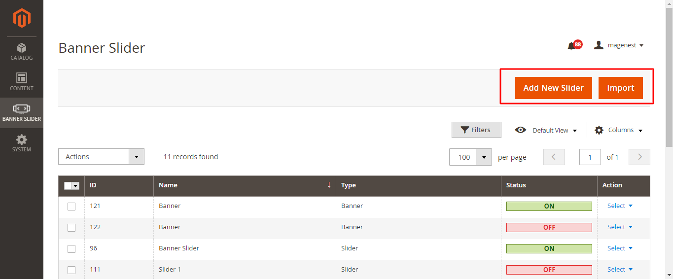
You can create a new banner, or import one.
Create a Banner
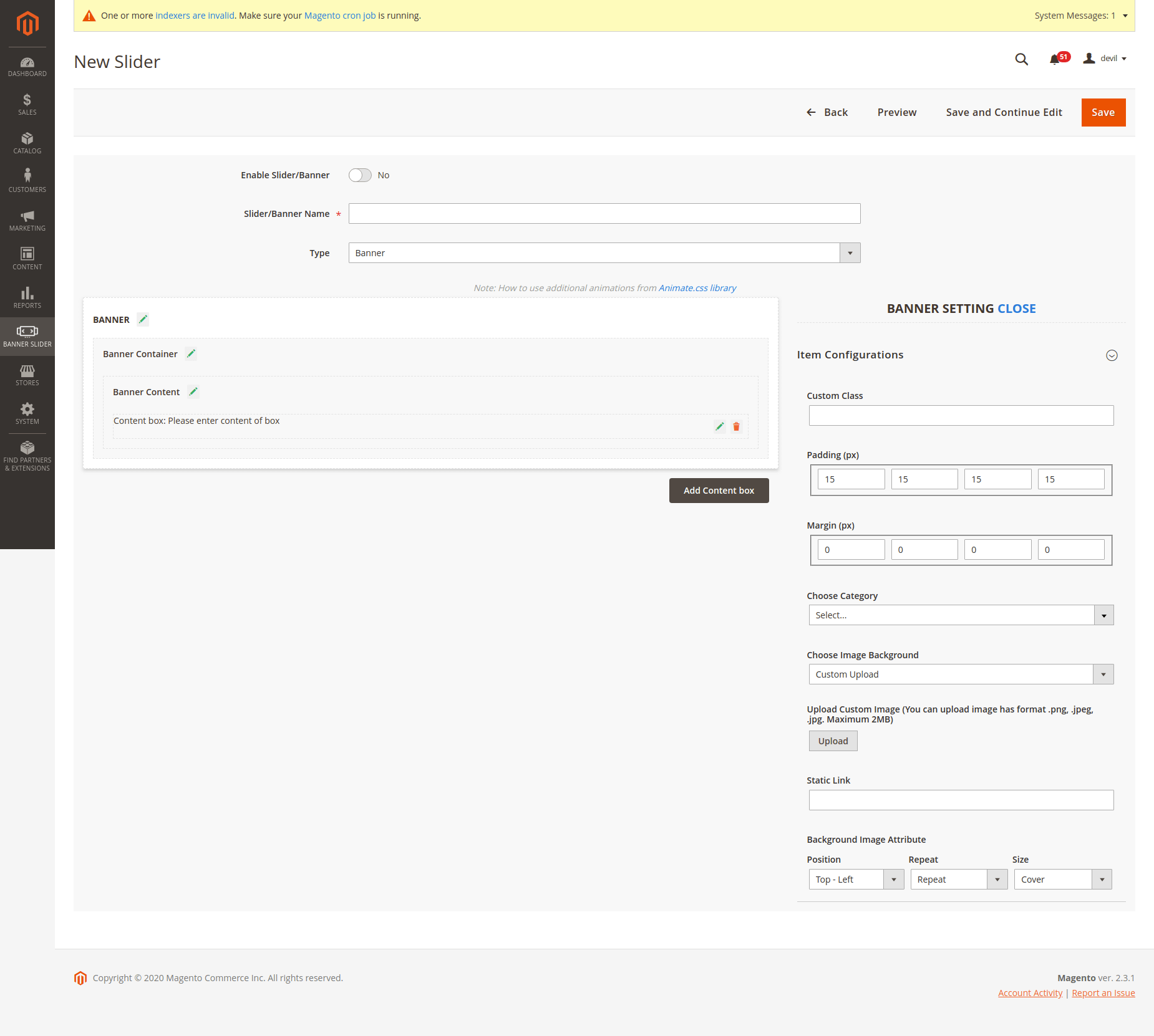
Click Click on the Add New Slider button on the Manage Banners/Sliders page
...
On Slider Setting section:
- Enable or disable the slider/ banner
- Slider/ Banner Name: insert the name of the banner/slider
- Type: Choose Banner's type
Banner
Single Slider
2 Sliders with Synchronized Transition.
- Active From Date: Choose the day to activate the banner/slider.
- Active to Date: Choose the day to deactivate the banner/slider.
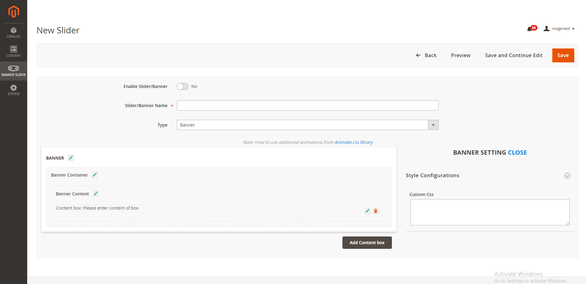
Add custom CSS there to style your new banner
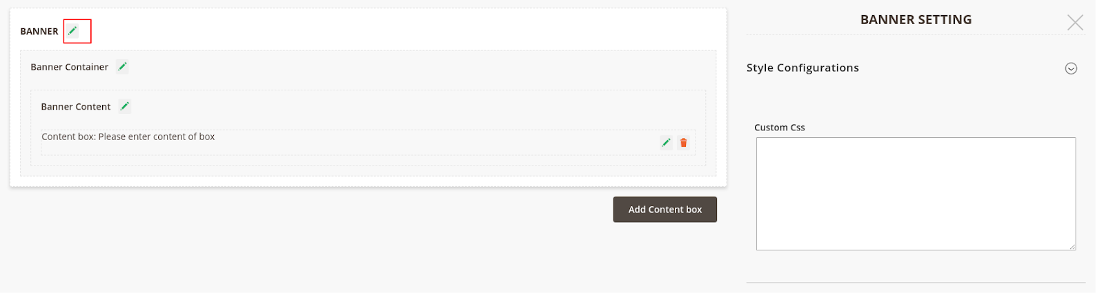
- Click on the Edit icon next to Banner, you'll see the Style Configuration box. You could add custom CSS there to style your new banner.
Add a New Banner with a configuration feature.
If If you do not have a CSS banner available, you could add it with the Banner Container configuration feature.
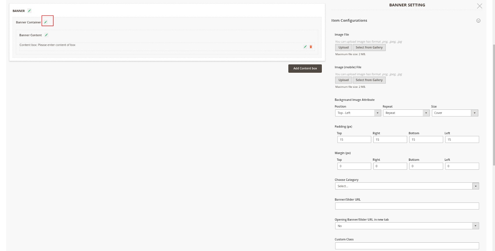
Custom the Banner Container
- Click on the Edit icon next to the Banner Container
...
- Image File: Upload a new background image for the banner.
 Please note that you can only upload the image with png, .jpeg, .jpg. format with a maximum size of 2MB
- Image (mobile) File: Upload a new background image for Mobile Please note that you can only upload the image with png, .jpeg, .jpg. format with a maximum size of 2MB
Note: you can choose custom upload or Select from Gallery.
...
- Background Image Attribute
- Padding and Margin:
- adjust the dimension of the banner according to your requirement.
...
- View the effects of your changes on the demo banner on the left side.
- Choose Category: select one category on the drop-down list to get data for the banner.
...
- If you choose Category, the image of the selected Category above will be set as a banner background.
- Choose Custom Upload to upload a new background image for the banner. Please note that you can only upload the image with png, .jpeg, .jpg. format with a maximum size of 2MB
- Banner/Slider URL: You can fill in a URL under the http/https, ftp format to redirect users to an external link when they click on the banner.
On Banner Content Configuration:

- Size: Set the size of the banner
- Padding and Margin section, adjust the dimension for the banner padding and margin to fit your requirement. Then see the effects for your changes on the demo banner on the left side.
- Choose the color of the banner background. You could also set the opacity of the background color.
- Position: You can set the banner content position as Left, Right, Center, or Custom. If you select Custom, you'll be able to set the banner margin freely.
...
- Opening Banner/Slider URL in a new tab: Choose Yes to set when users click on Banner with URL, there will be a new tab
- Custom Class: enter the name of the custom class which is defined on the Banner Configuration.
Custom the Banner Content
Click on the Edit icon next to the Banner Content
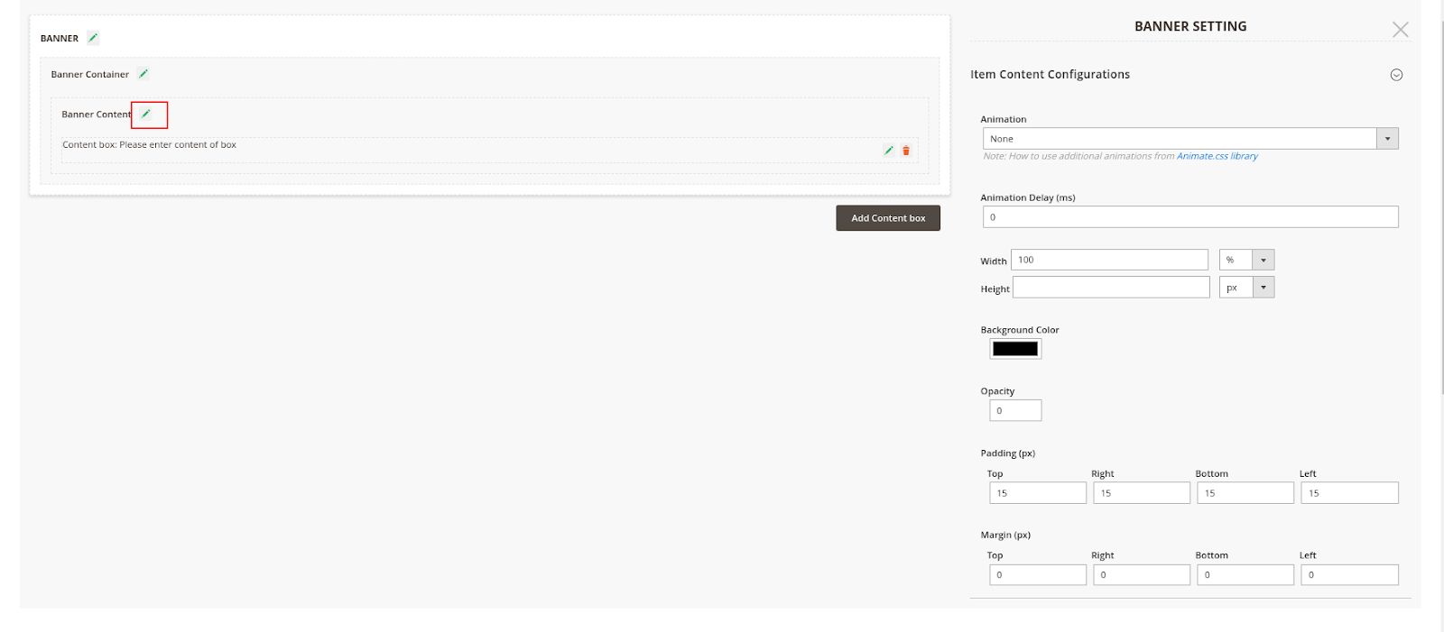
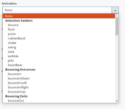
- Animation: Choose banner content animation.
There is a wide range of options for you to select according to your needs
...
- Animation Delay: Set the time (per second) to delay the banner content's effect.
- Width, Height: Set size for the content of Banner
- Padding and Margin: Adjust the dimension for the banner padding and margin to fit your requirement.
View the effects of your changes on the demo banner on the left side.
- Background Color, Opacity: Choose the background color for the content of Banner
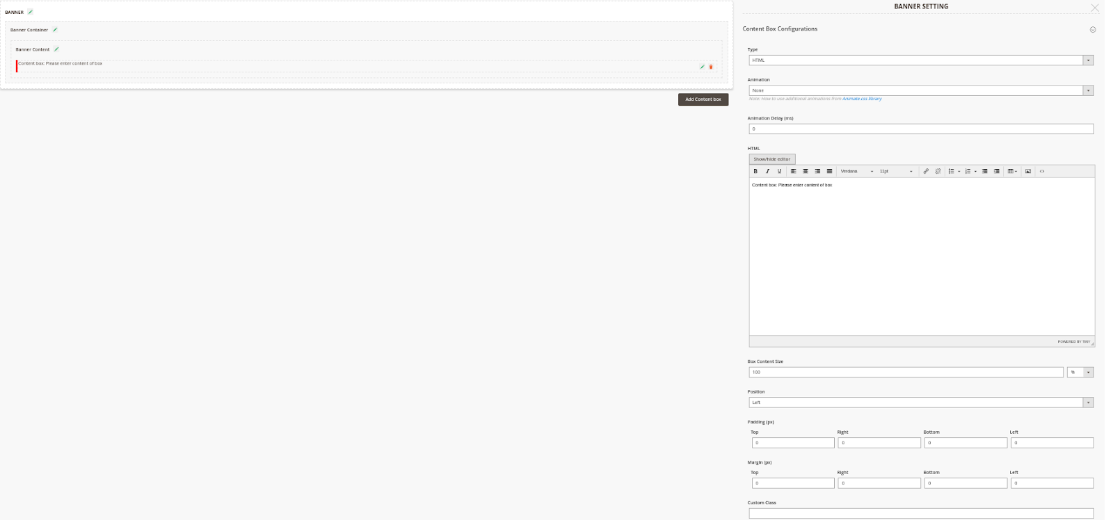
On Custom the Content Box ConfigurationsBox
If you click on the Edit icon in the Content box, you'll be able to configure the content.
- Type: You can select Button, Text, or HTML
If you select HTML you'll be able to edit the banner button according to the image below
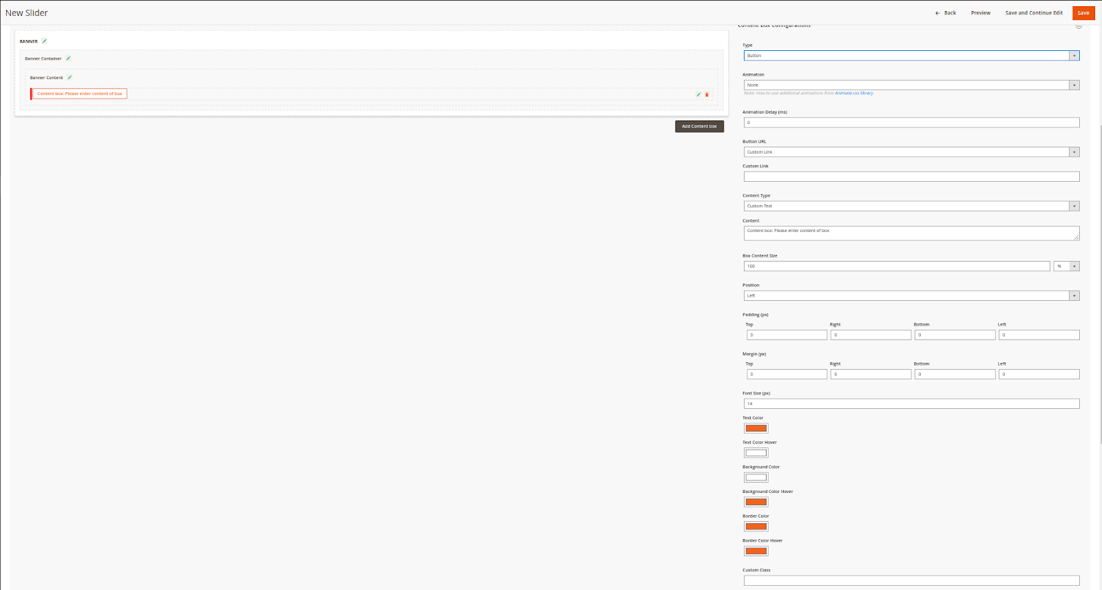
Once you select Button,
...
you'll be able to edit the banner button according to the image below
...
...
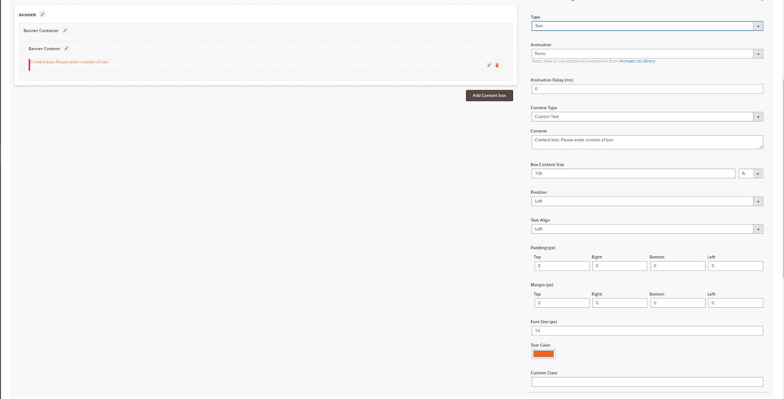
Once you select the
...
Text type, you'll be able to configure the banner text like the image below
...
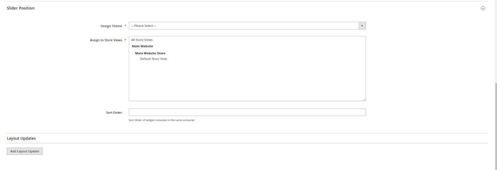
On tab Slider Position:
- Design Theme
- Assign to Store Views
- Sort Order: Select the order to display the banner/slider on the front end
- Layout Updates: Set up the banner/slider position
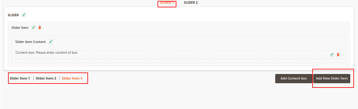
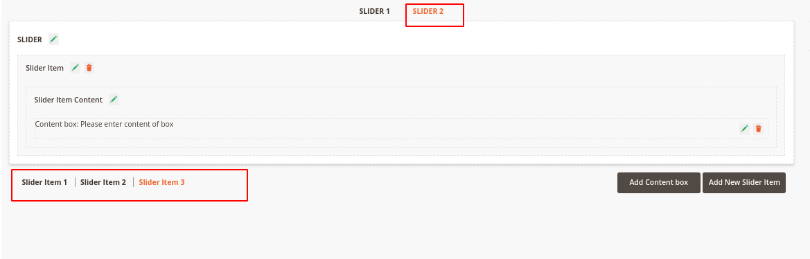
Create a Slider
Under the quick preview box, click on the Add New Slider Item button to add the number of sliders that you expected.
Click on each Slider Item button on the left to configure for each slider.
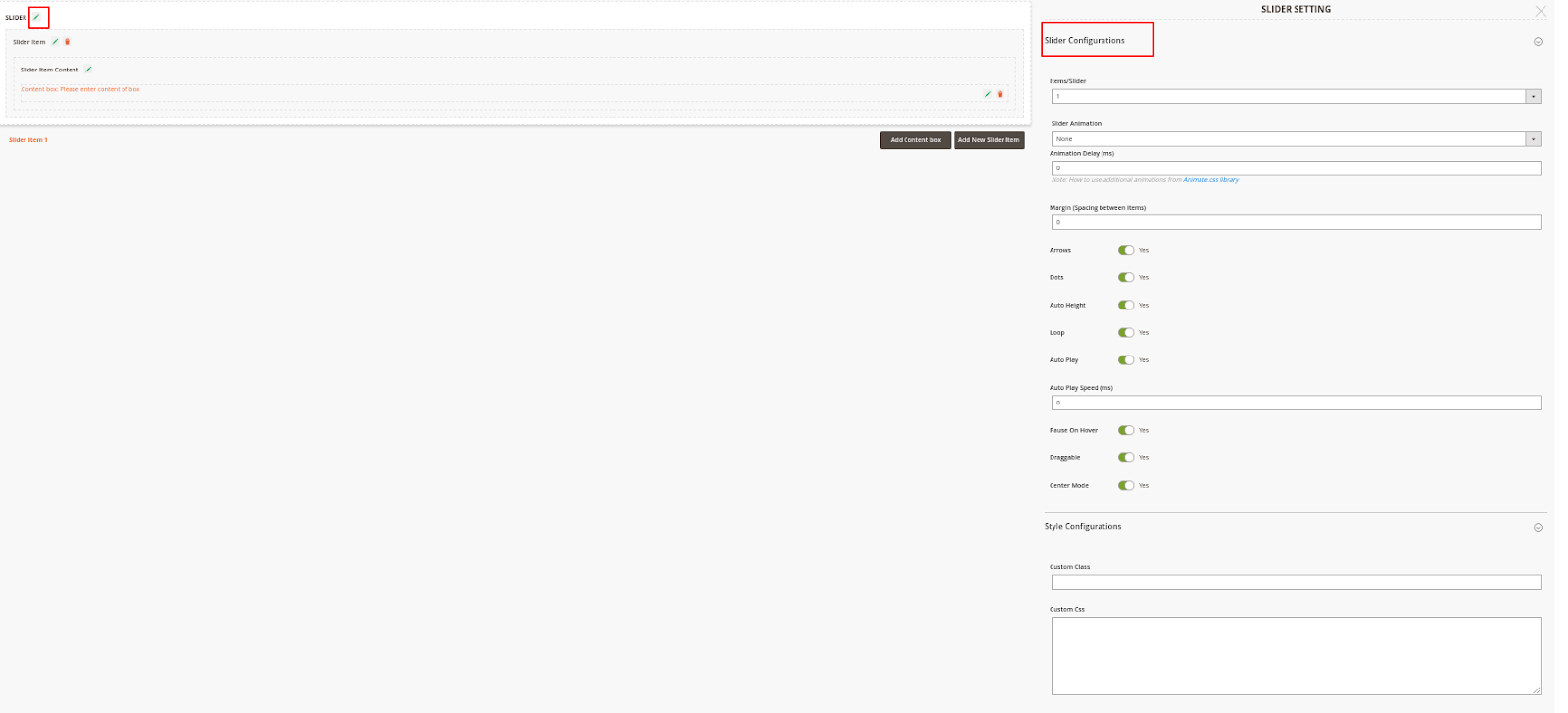
On Slider Configuration:
- Items/Slider: choose the number of slider items that will appear at the same time in a slide.
- Slider Animation: Choose Slider animation
- Animation Delay (s): Set the time (per second) to delay the slider's effect.
- Margin (Spacing between items): set the distance between the slider items. The unit for space is Px.
- Arrows: display the switch button aside.
- Dots: display the dots on the slider footer when switching the sliders.
- Auto Height: synchronize the height of slider backgrounds with different sizes. The largest height will be set as the default height.
- Loop
- Auto Play
- Draggable
- Center Mode
Under Style Configuration
- Custom Class: Enter the name of the custom class that is defined in the below section.
- Custom CSS: define the custom CSS to style the slider.
On Item Configurations and Item Content Configurations, please refer the instruction for this part of Banner Settings
Create 2 Sliders with Synchronized Transition
There have to be 2 default sliders created.
These sliders will be displayed on the front end at the same time and interact with each other.
On each slider configuration, click on the Add New Slider Item button to create new slider items. Note that when a number of slider items created on one slider, an equal number of slider items will be generated automatically on the other slider.
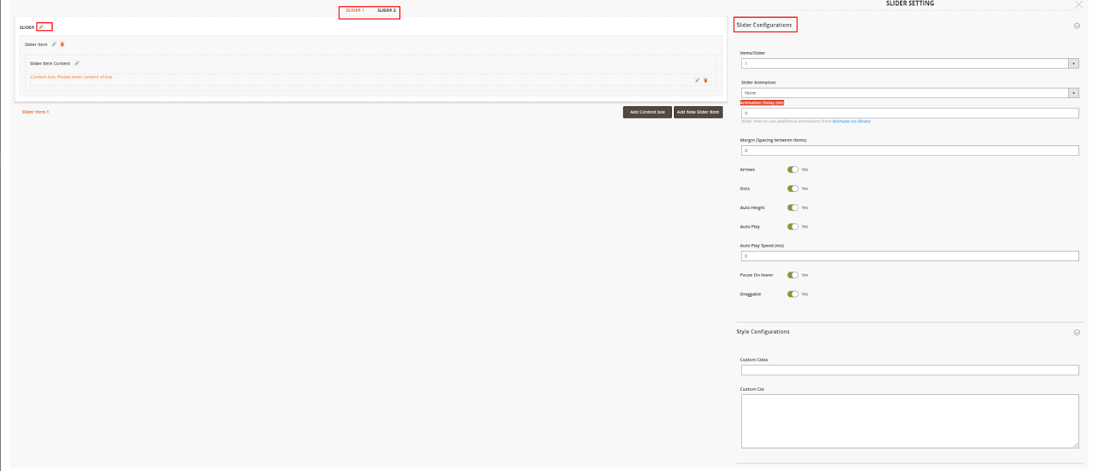
Note: There will be a number of slider items created automatically on one slider. This number equal to the number of slider items added on the other slider.
The item on one slider will be displayed at the same time as the item in the same order on the other slider. For example, slider item 2 in slider 1 will be displayed with slider item 2 in slider 2 at once.
Import Banner/Slider
On the Admin sidebar, choose System > Data Transfer > Import
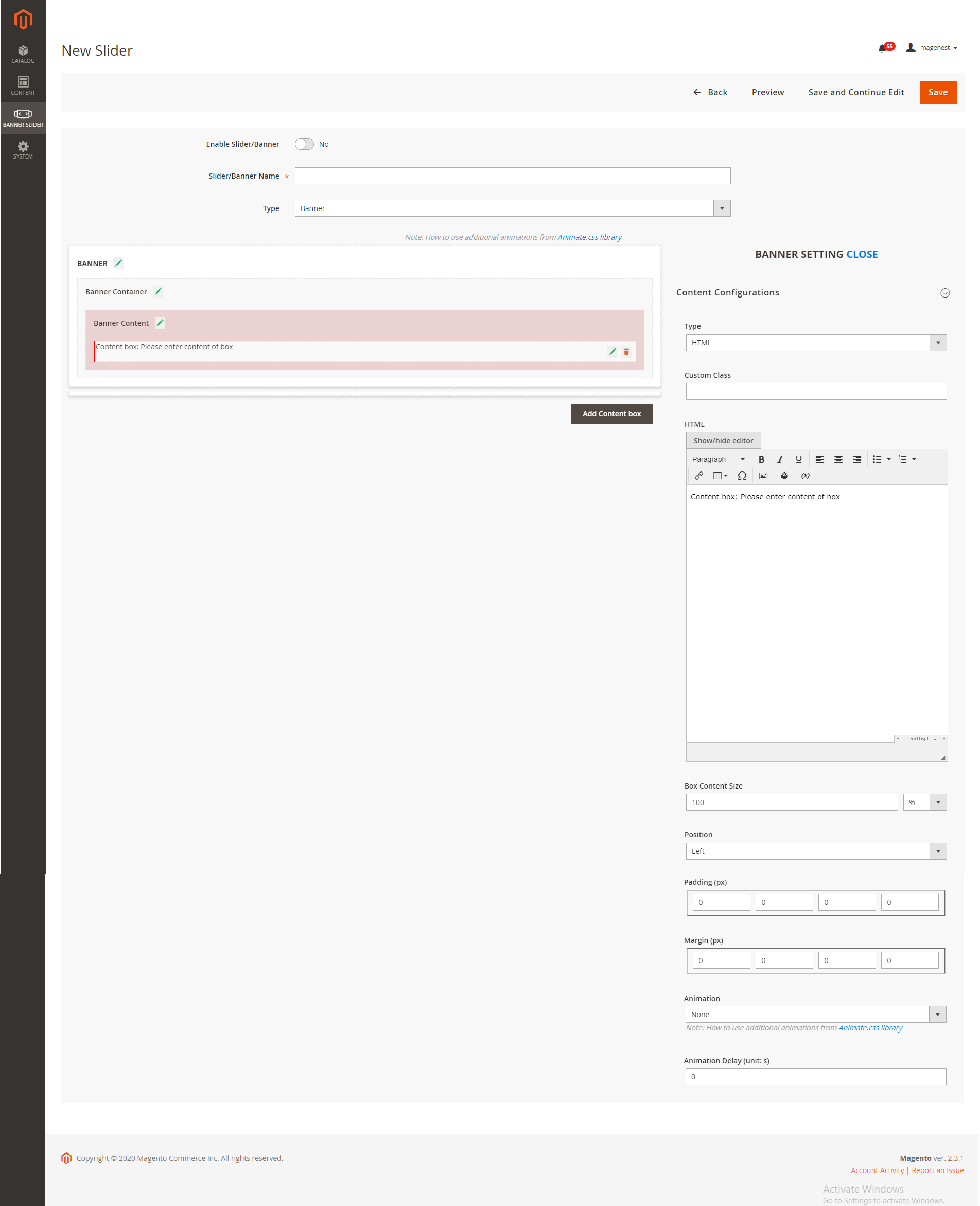
- If you select the HTML type, you can add the banner HTML and configure it like the image below
Click on the Import button to import a banner template
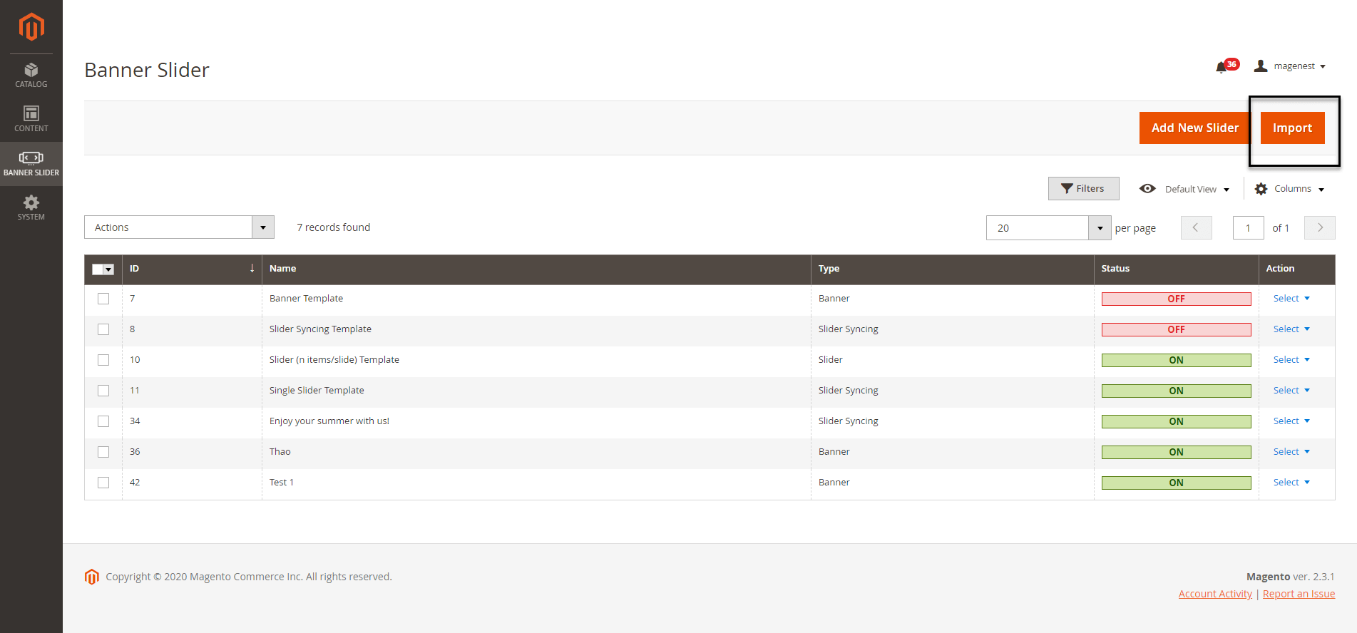
- On the Import page
...