...
| Status | ||||||
|---|---|---|---|---|---|---|
|
- This is a single line input
...
- field for text.
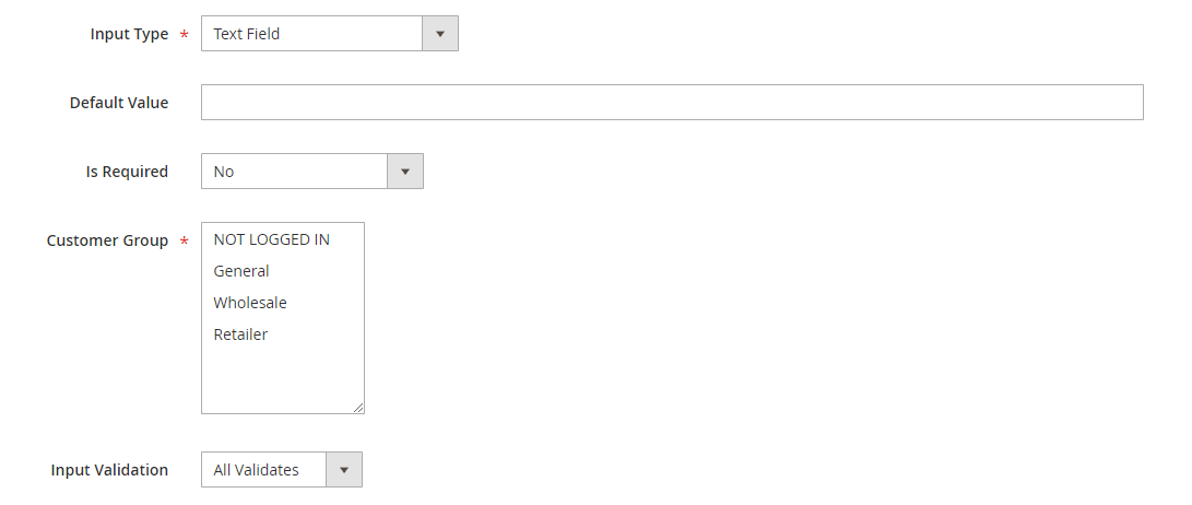
- Default Value: enter the default text which appears in the field as a suggestion. Customer can edit the text.
...
- Input Validation: select among 6 options: Alphanumeric, Numeric Only, Alpha Only, URL, Email, Date and All Validates.
- Text Field display:
| Status | ||||||||
|---|---|---|---|---|---|---|---|---|
|
This is a multiple-line input field for entering paragraphs of text.
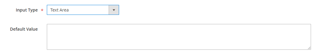
- Default Value: enter the default text which appears in the field as a suggestion. Customer can edit the text.
- Text Area display:
| Status | ||||||
|---|---|---|---|---|---|---|
|
The date can be entered by making a selection from the popup calendar.
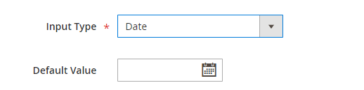
- Default Value: choose the default value which appears in the field as a suggestion. Customer can choose another date.
- Date display:
| Status | ||||||||
|---|---|---|---|---|---|---|---|---|
|
This type allows displaying a drop-down list of values. To select more than one option, the customer can hold the Ctrl key down and click each item.
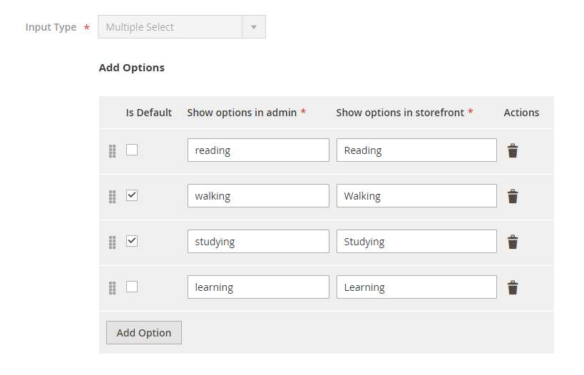
- Click on Add Option button to add more option to the drop-down list for the attribute.
- Tick on the tickbox under Is Default column to set the option as default.
- Show option in admin: enter the title of the option which displays on the backend.
- Show option in storefront: enter the title of the option which displays on the customer side.
- Multiple Select display:
| Status | ||||||
|---|---|---|---|---|---|---|
|
There will be a list of options with images for customer's selection.

- Click on Add Option button to add more option.
- Choose the image and fill the title for each option.
- Multiple Select With Images display:
| Status | ||||||||
|---|---|---|---|---|---|---|---|---|
|
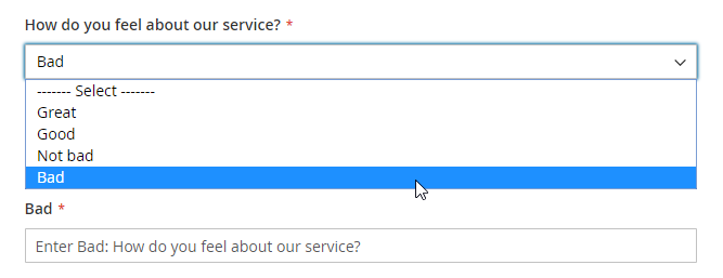
This type displays a drop-down list of values for customer selection.
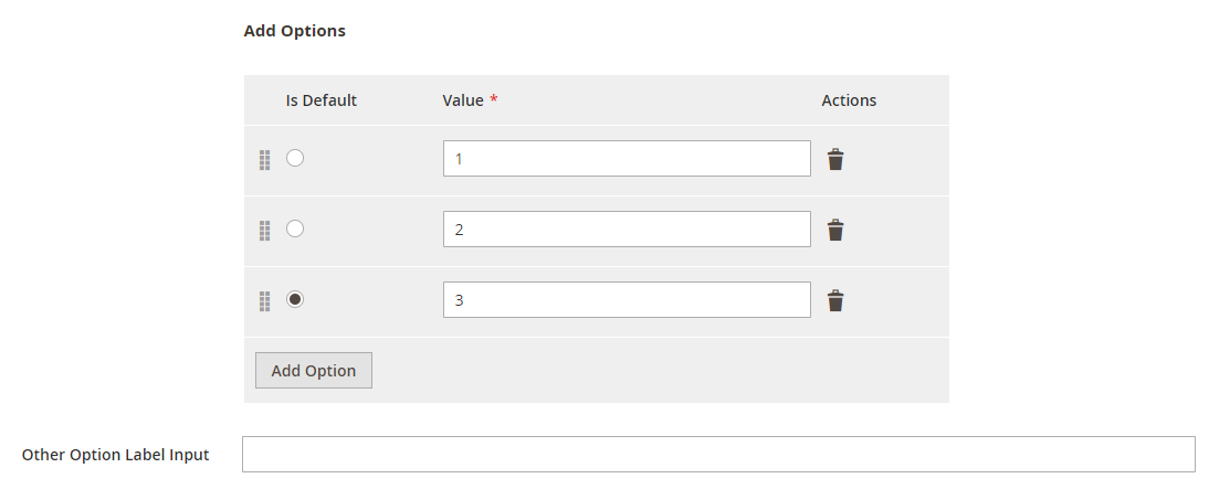
- Click on Add Option button to add more option.
- Value: Enter the title for each option in the dropdown list.
- Other Option Label Input: enter the text for the last option in the drop-down list, which is the option for the customer who has the question beyond the listed answers in the default list.
- Dropdown display:
| Status | ||||||||
|---|---|---|---|---|---|---|---|---|
|
This type allows displaying a drop-down list with pre-defined options of “Yes” and “No”.
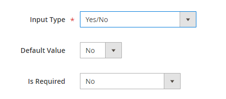
- Default Value: choose the value that will be marked by default. Customer can choose another option.
- Yes/No display
| Status | ||||||||
|---|---|---|---|---|---|---|---|---|
|
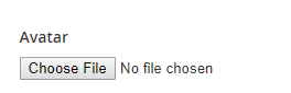
This type allows the customer to upload their image.
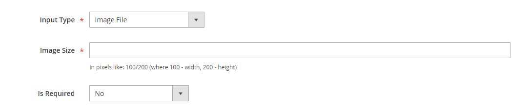
- Image Size: set the layout size for the uploaded image. The size unit in this field is "pixels". Follow the note under this field to set the proper size.
- Image File display
| Status | ||||||||
|---|---|---|---|---|---|---|---|---|
|
There will be a list of options with images that allows the customer to select only one option.
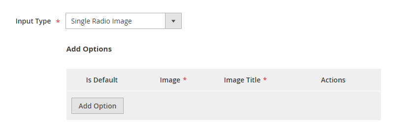
- Click on Add Option button to add more option.
- Choose the image and fill the title for each option, which will display with the image.
...
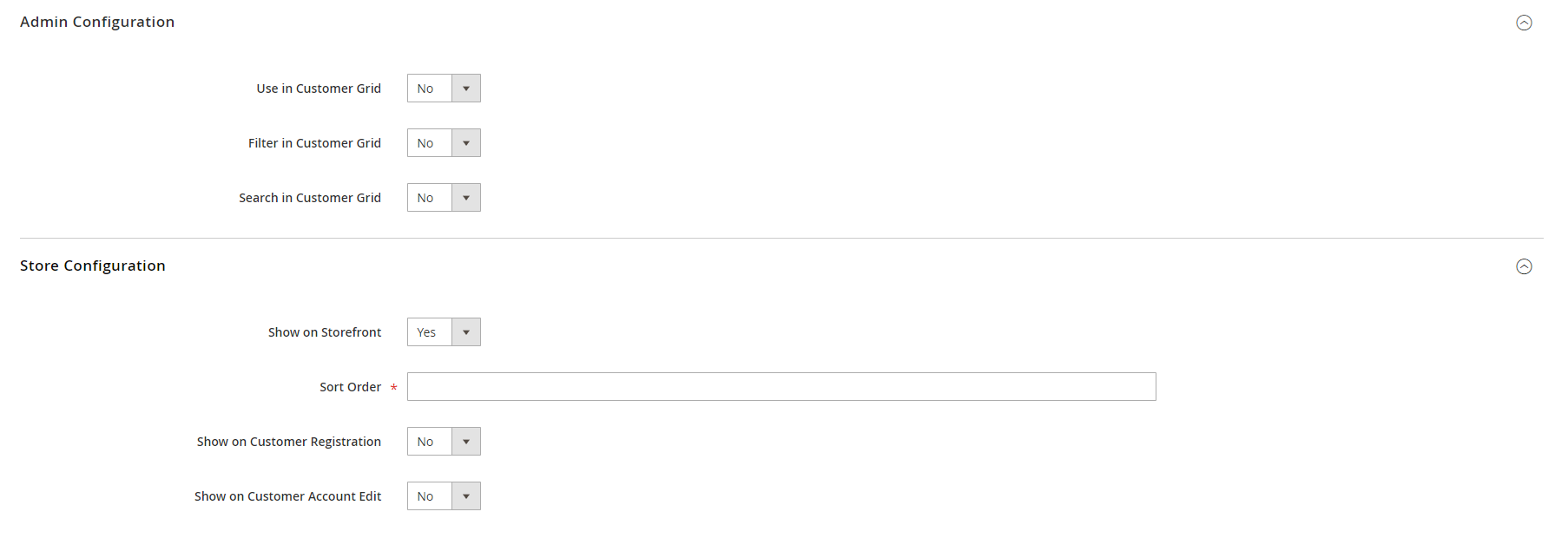
This section allows setting for the display position for of the attribute in backend by choosing Yes or No in each field: Use in Customer Grid, Filter in Customer Grid and Search in Customer Grid.
...
This section allows setting display for the attribute display in on the storefront: on Customer Registration page.
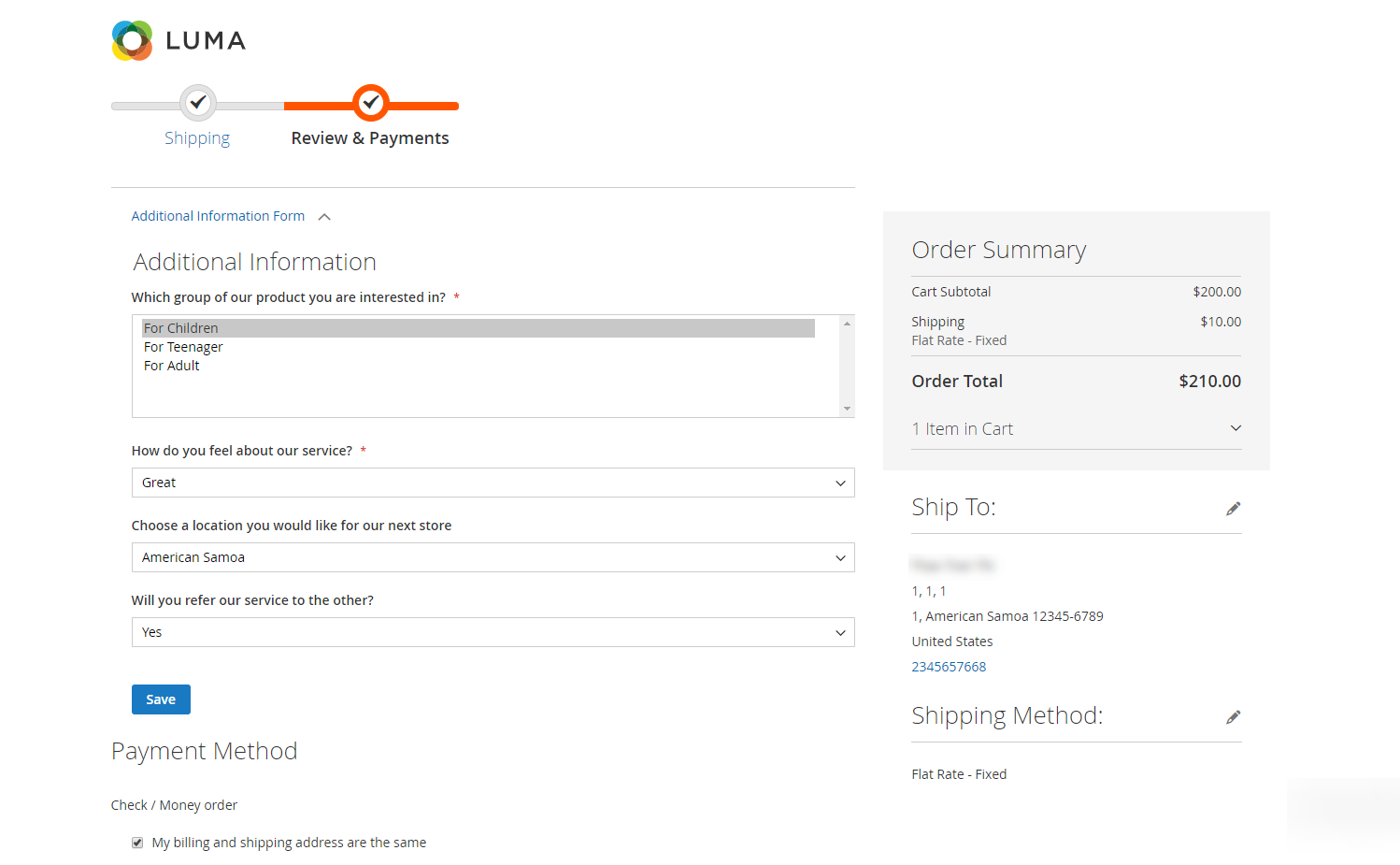
Enable the attribute on the store, then set the sort order and assign the attribute to some pages such as Customer Registration, Customer Account Edit page or and Customer Checkout checkout page.
 After finishing the setup, click Save to save the attribute and view on the frontend.
...